BCN Clàssics

Musical tension, turned into a system

Client

BCN Clàssics

Year

2026

What we did

Typefaces

  • Parabole
  • Larken
  • Inter

Credits

  • Fotografía: Antoni Bofill
  • Motion: Aharón Ferradás
  • Client: Mireia Ayguadé
  • Client: Rita Molinero
  • Project in collaboration with Errea

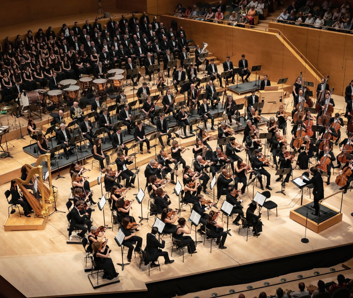
BCN Clàssics programmes international classical music in Barcelona: major orchestras, soloists and conductors performing at the Palau de la Música Catalana and L’Auditori.

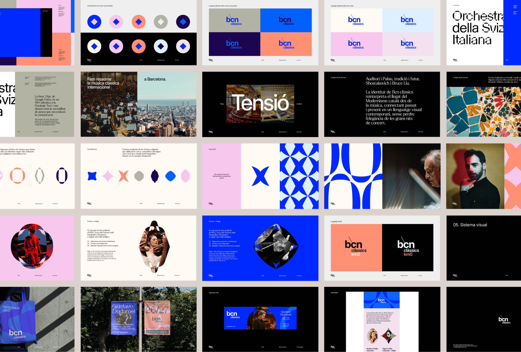
We developed a new brand manual to define how all the visual elements work together, giving the brand a more recognisable, flexible and living system.
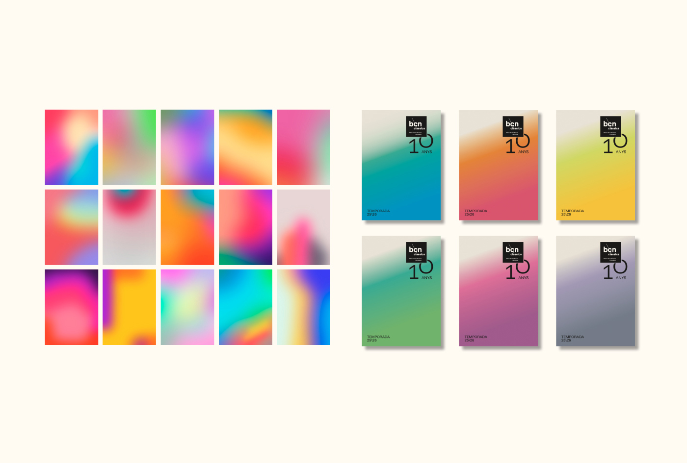
Previous visual identity

Classical,
not old-fashioned

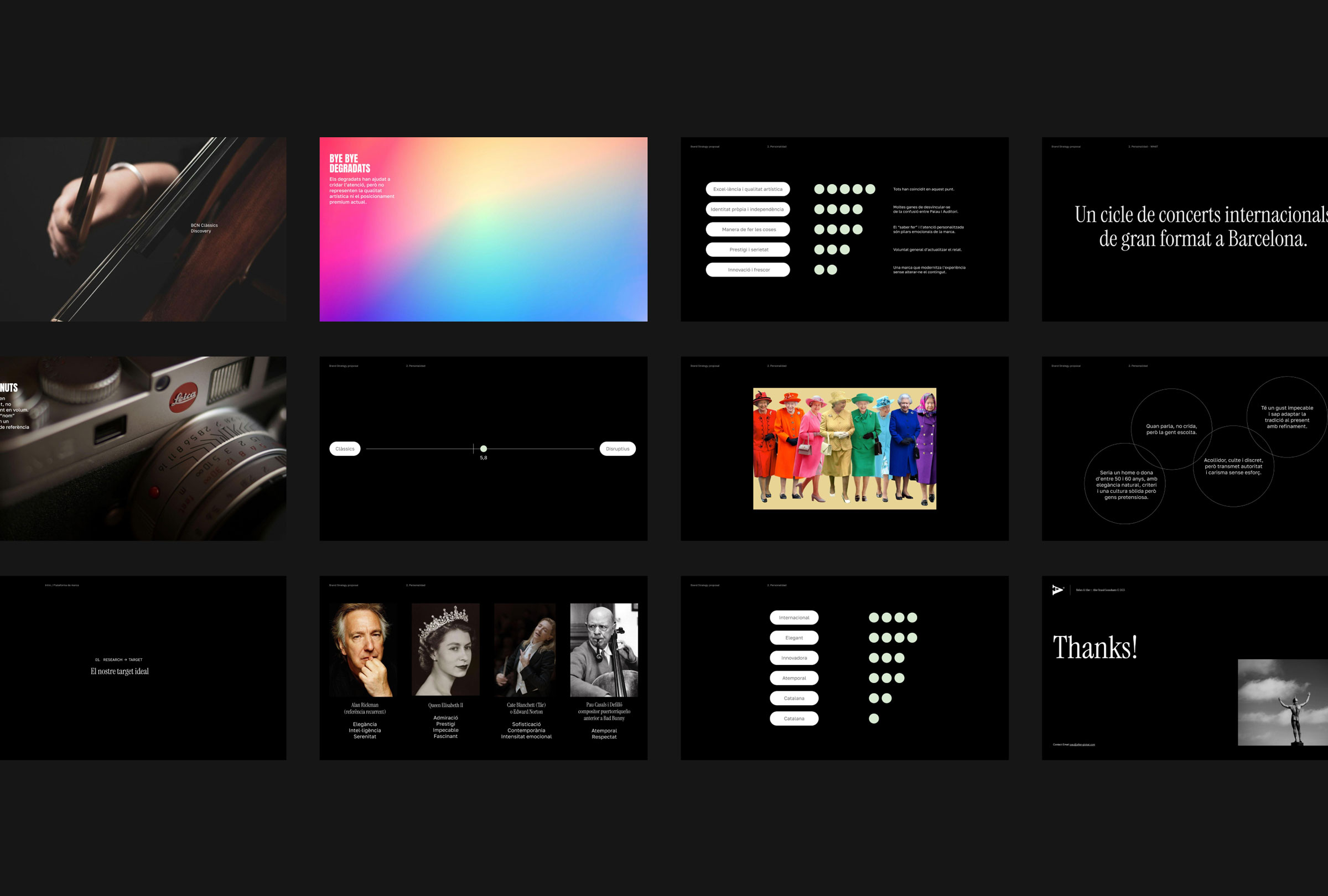
Over the past ten years, BCN Clàssics had built recognition. Its logo was sober, direct and familiar to subscribers. The issue was not the logo itself, but the visual world around it: a gradient-based system designed to grab attention, which had worked for several years but no longer responded to the brand’s current needs. The brand needed to evolve without losing what it had already built.
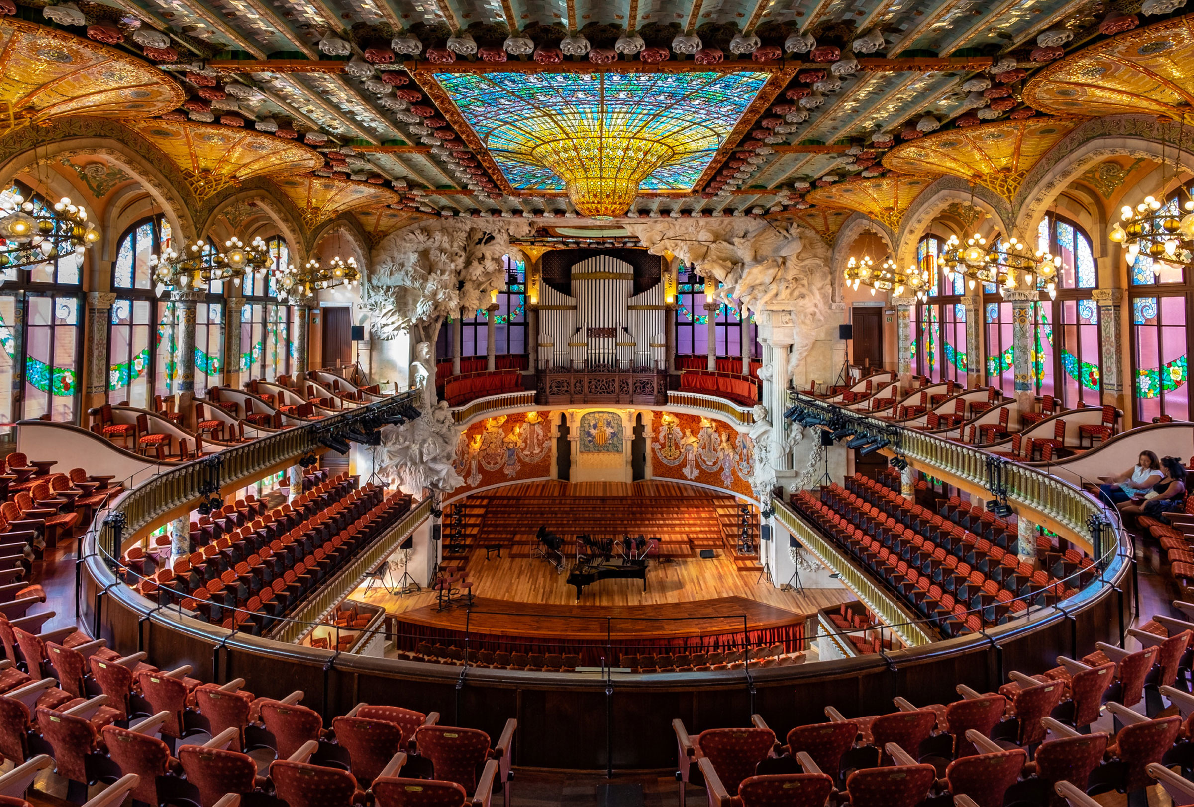
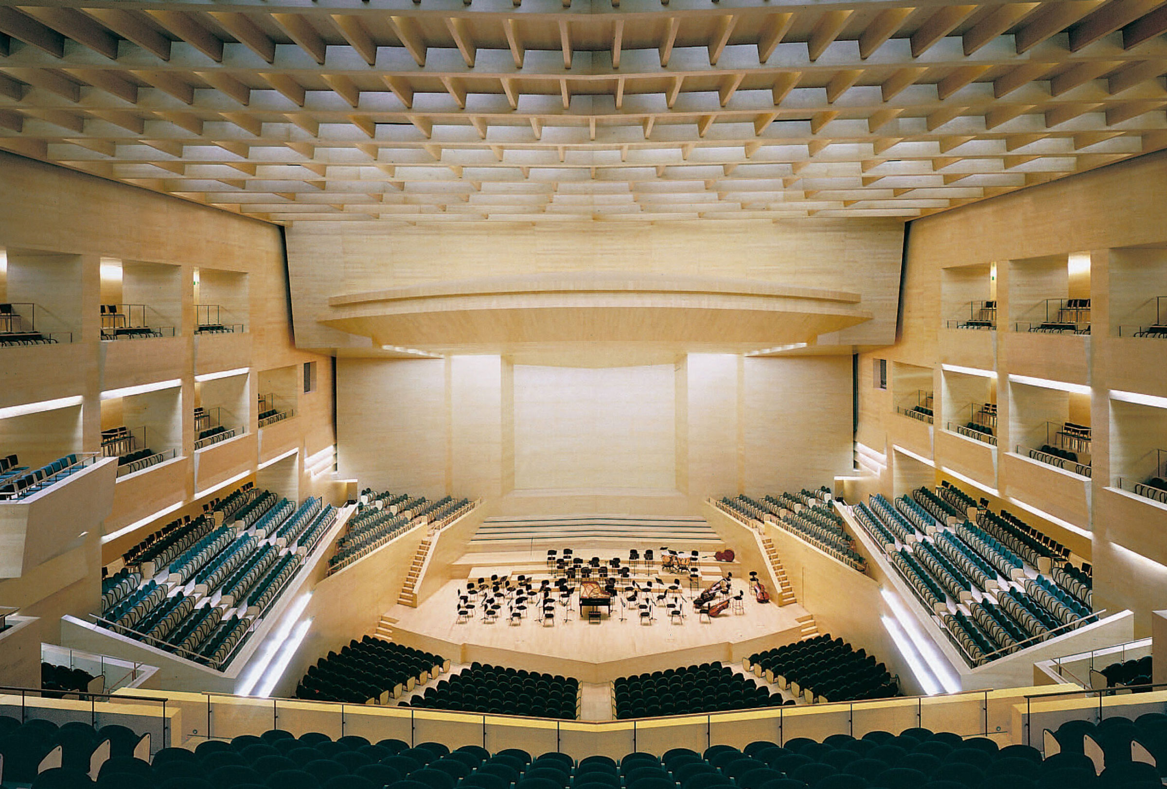
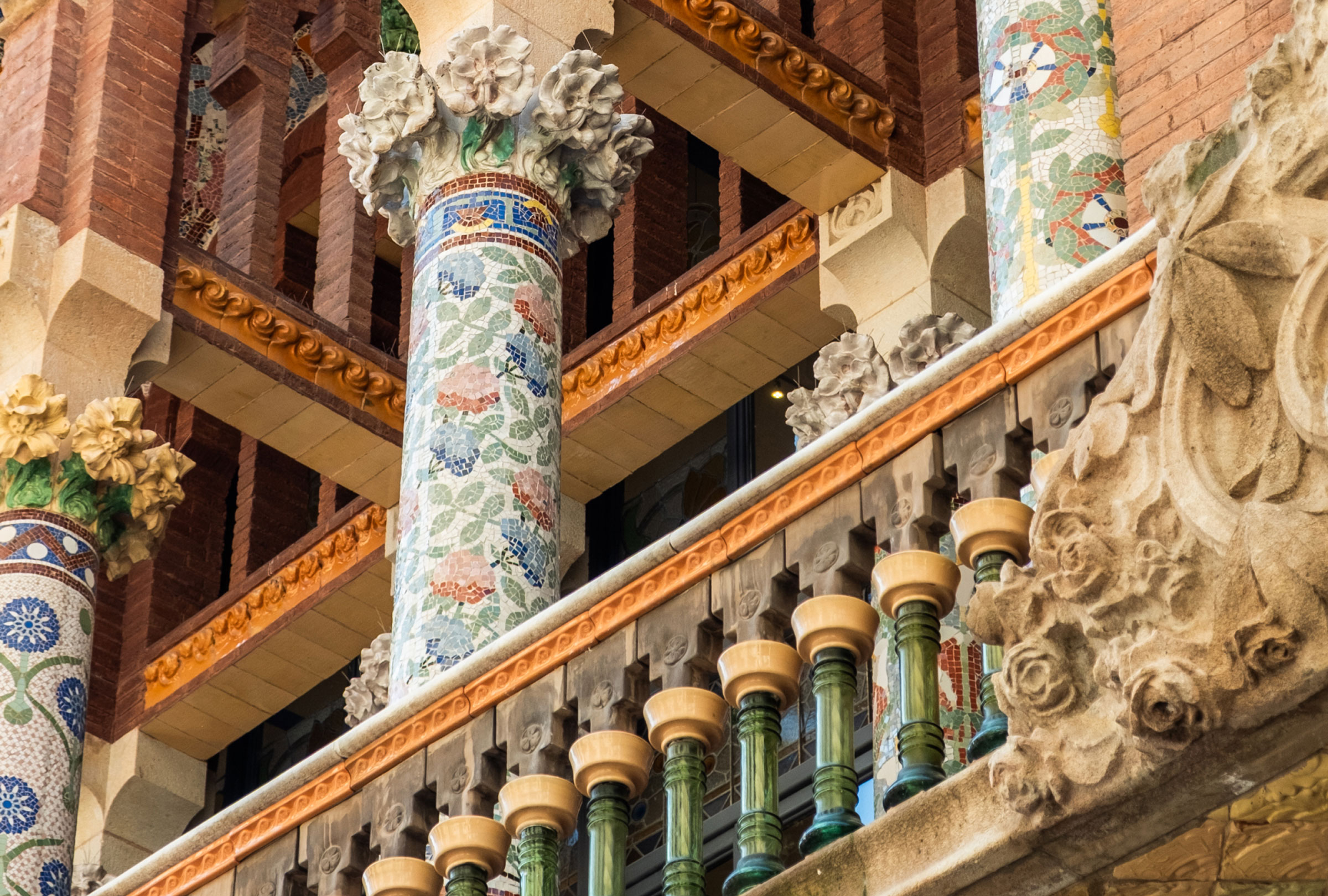
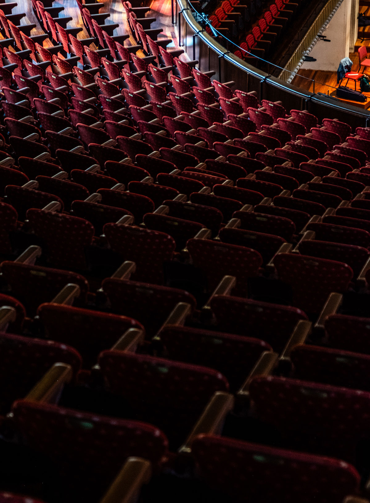
BCN Clàssics lives between the Palau de la Música Catalana and L’Auditori. Two exceptional and completely different venues: one of the great works of Catalan Modernisme, designed by Lluís Domènech i Montaner, and Barcelona’s main symphonic hall, designed by Rafael Moneo. The new identity had to move freely between both worlds, without choosing sides.
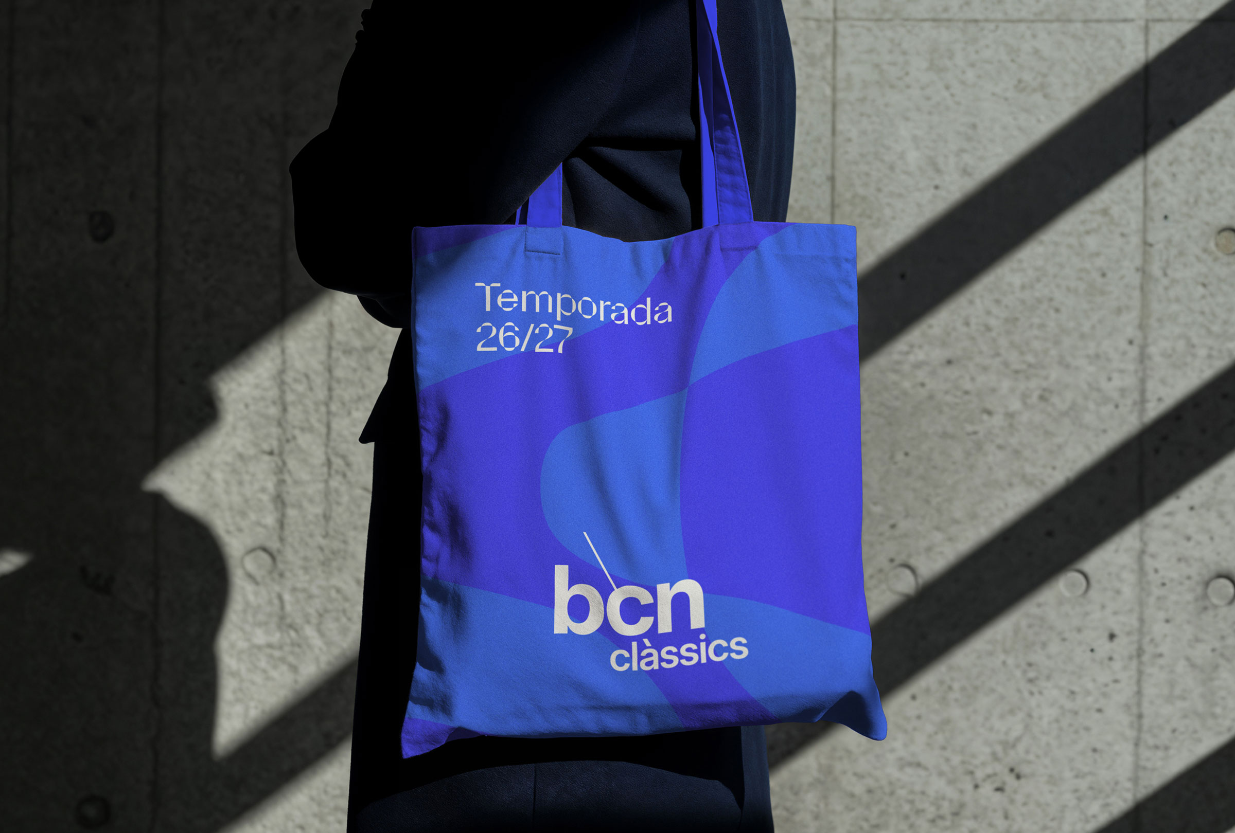
The logo stays. Ten years of recognition are not something you throw away. The problem was never the logo, but everything around it. So we redesigned the rest of the system: typography, colour, forms, photography and key visuals, creating a visual language that could strengthen brand recognition.
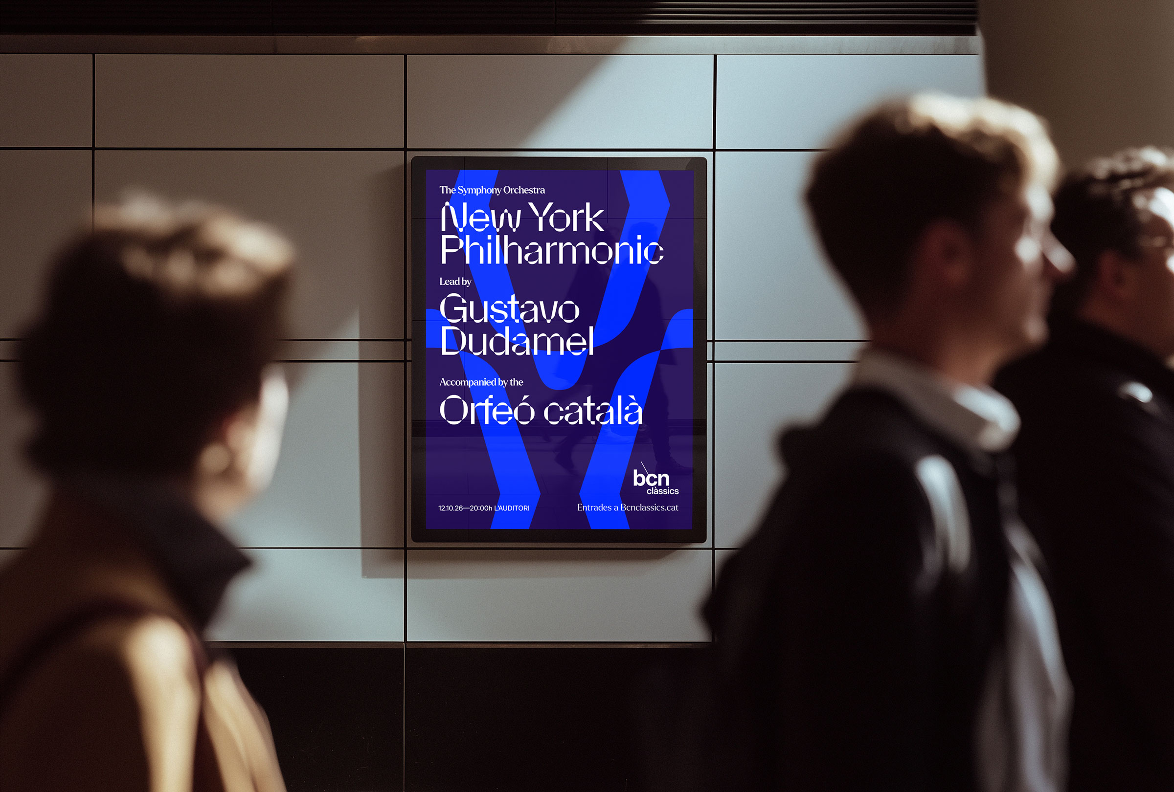
A living identity had to feel like live music. It needed to occupy space and change slightly with every interpretation. The visual system is built around that idea. La Parabole has a hybrid character: precise like a musical score, yet organic like the work of Gaudí and Domènech i Montaner. It becomes a bridge between technical rigour and the sensitivity that defines the brand. Some of the system’s shapes literally come from its curves.
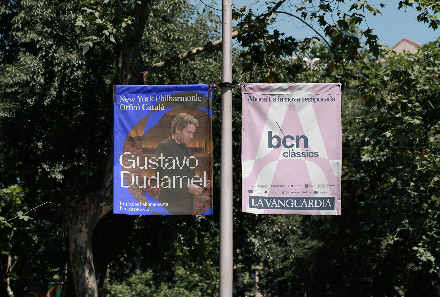
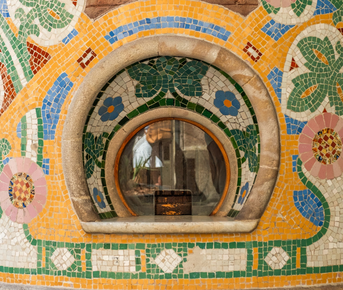
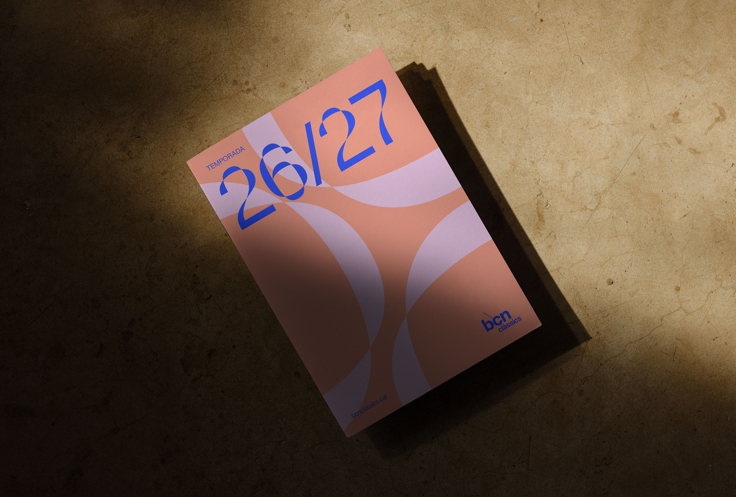
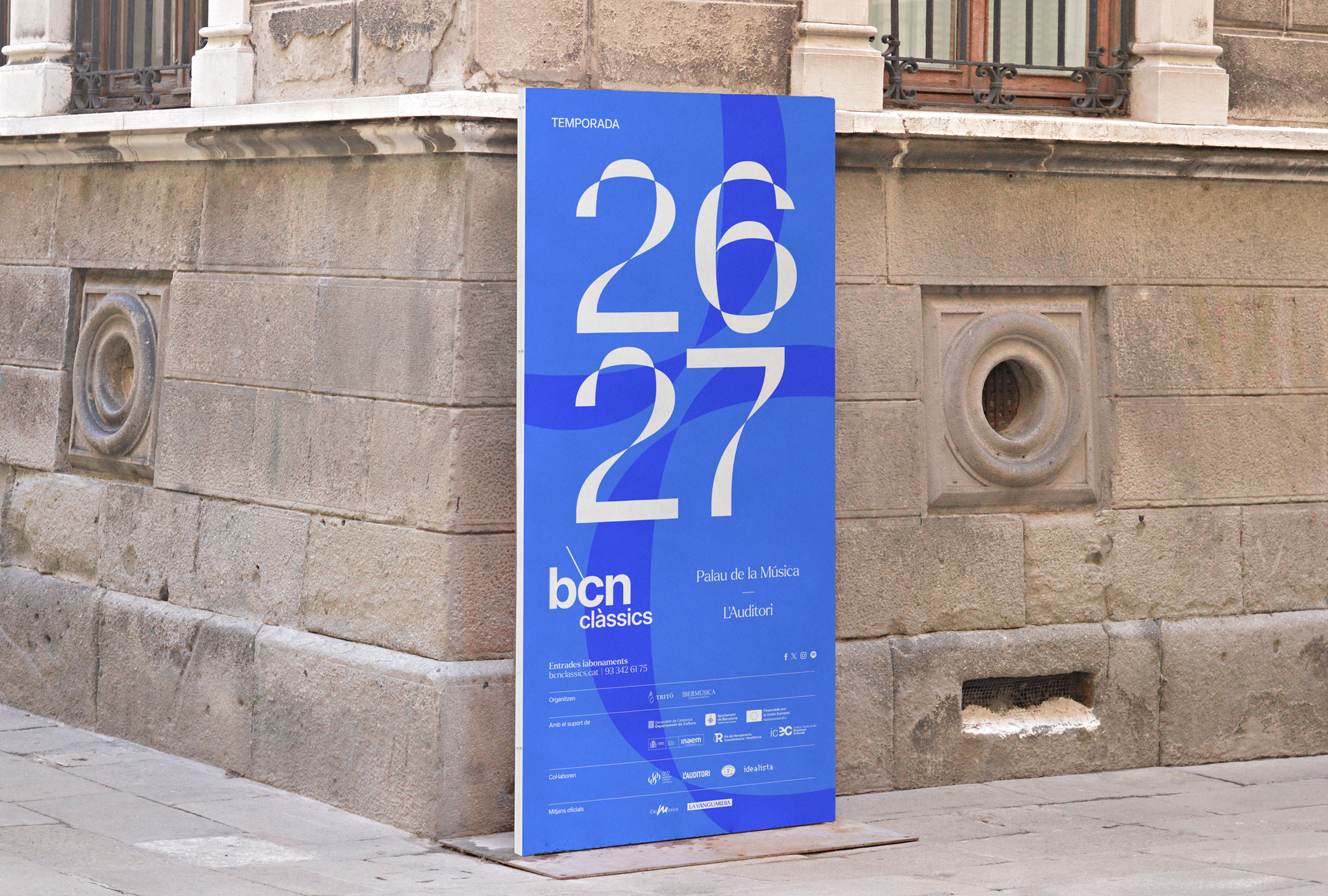
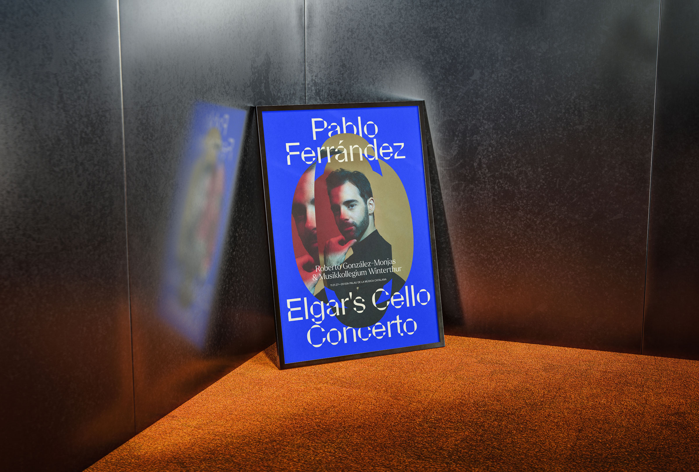
The system is built from custom shapes and counterforms, inspired by Catalan Modernisme from the late 19th century. We defined patterns, image containers and graphic elements capable of generating endless combinations. When combined with photography, the shapes create a sense of expansion, like sound filling a concert hall.
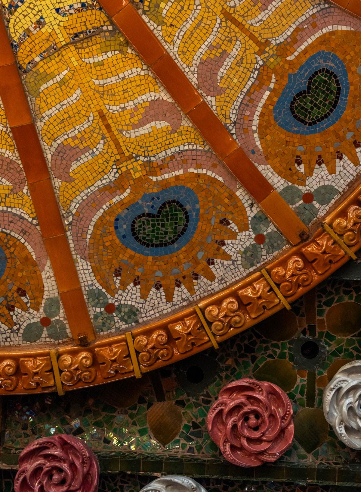
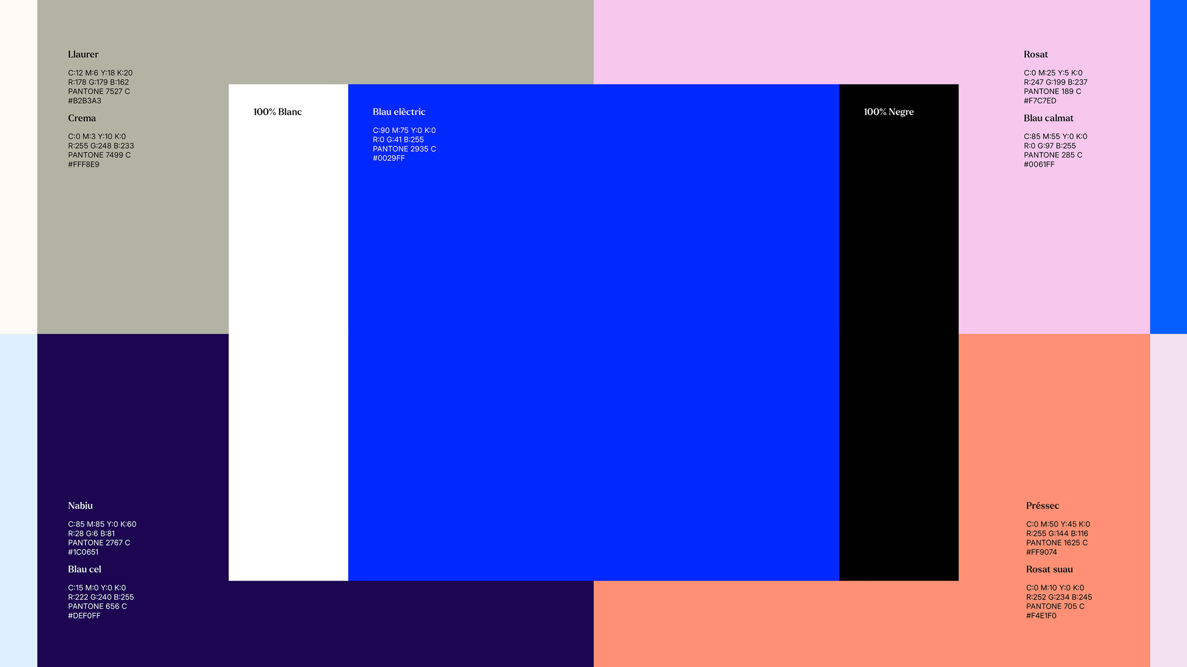
The colour palette comes directly from the Palau de la Música Catalana: columns, walls and mosaics where trencadís mixes ceramics, colour and natural motifs, turning architecture into a living surface.

Mireia Ayguadé

Comunicació BCN Clàssics

“The challenge was to shape a season of 19 concerts where each concert had its own identity and the prominence it deserved.”
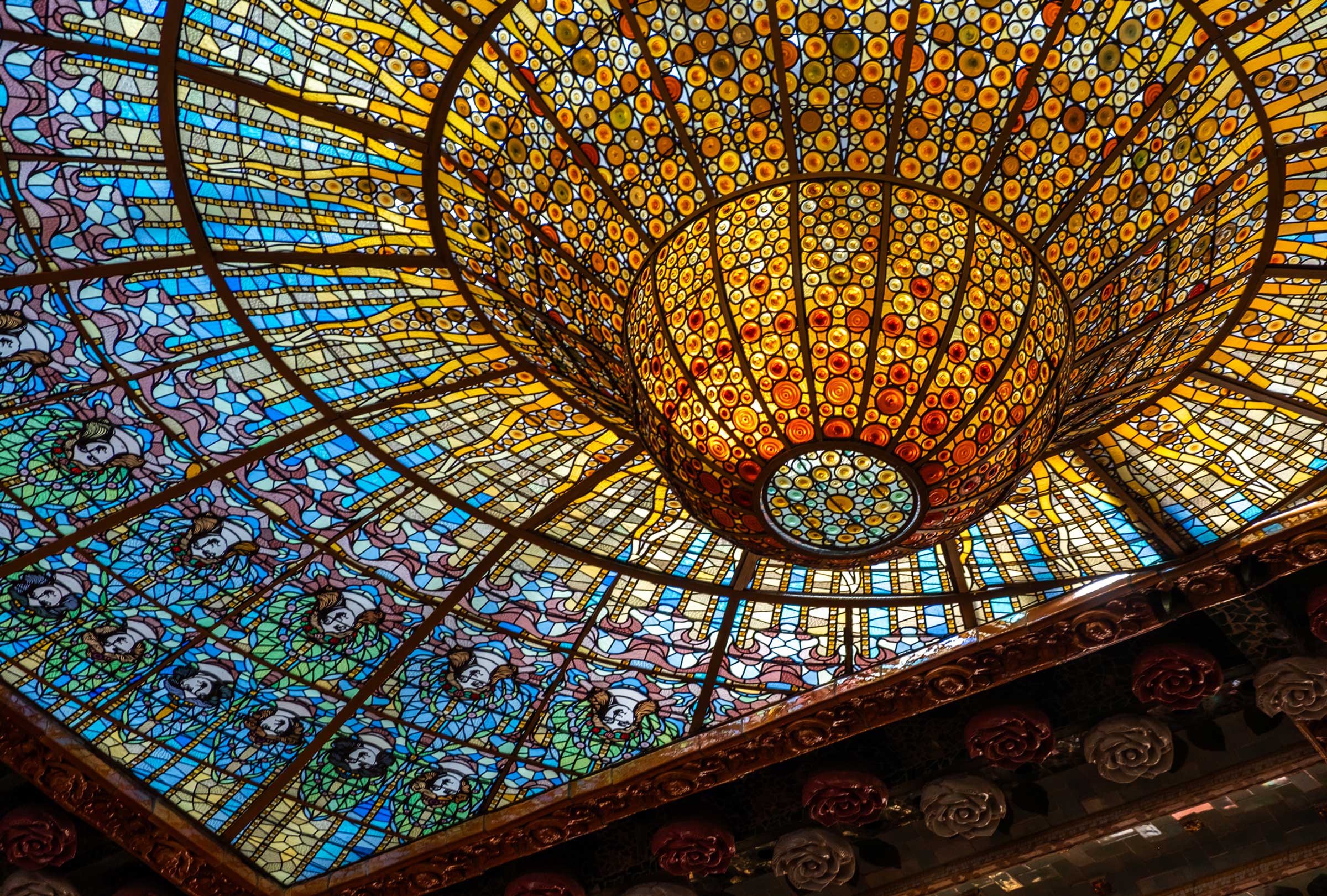
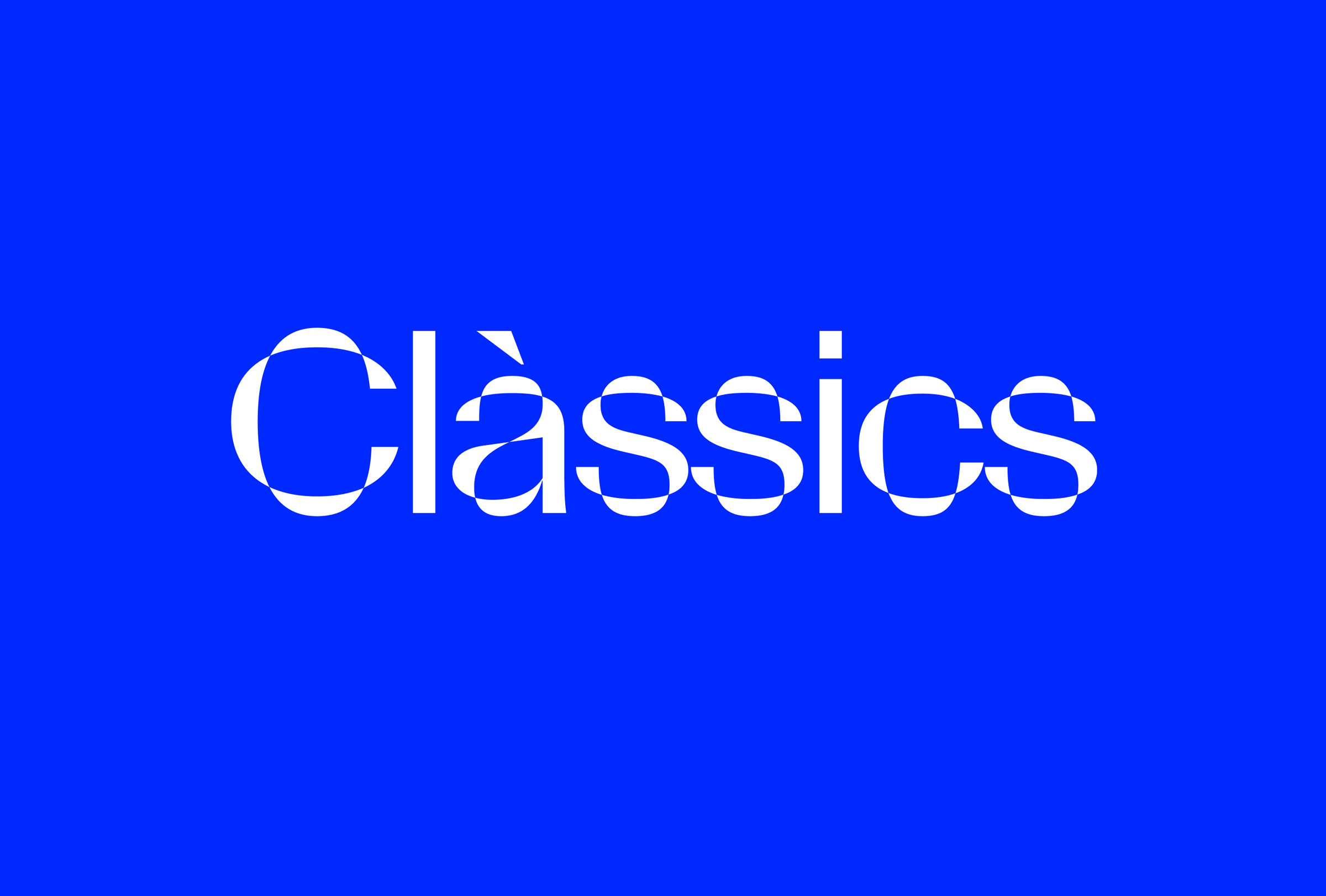
The new identity brings order to the brand, increases its presence and opens up a system designed to grow and adapt with each new season.

Numbers

Average musicians per orchestra

0

Seats in Sala 1 at L’Auditori

0

Concerts per season

0